🧭 Clearer navigation, new Discover and a cleaner design
Over the past weeks, we have been working with a clear focus on one thing: making the platform clearer, more convenient and more transparent – both for people and for search engines.
Here is what is already live 👇
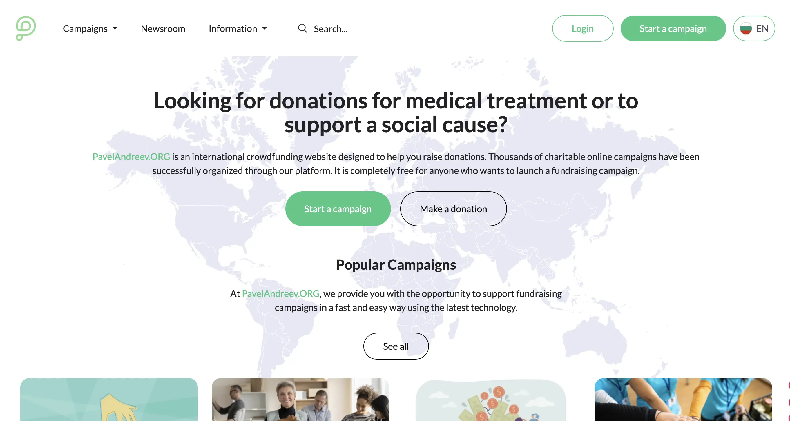
1️⃣ Completely new navigation (desktop and mobile)
We simplified the main menu to make it more logical and easier to use.
What’s changing:
-
The Campaigns menu now leads to a Categories submenu, which opens the new Discover page.
👉 Instead of 10 categories in the menu – one clear structure. -
This is a deliberate decision and part of our global SEO strategy – better indexing and clearer thematic clusters for Google.
-
We created a separate Information section, which includes:
-
Help Center
-
Frequently Asked Questions
-
How it works
-
Fees
-
Codes of Ethics for donors and beneficiaries
-
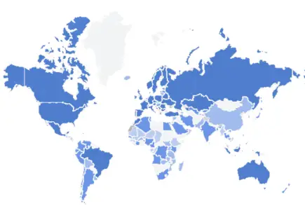
Country restrictions for campaigns
-
This information is no longer hidden in the footer. Transparency should be visible.
-
In the desktop navigation, the Newsroom now has a separate button.
Because good news, successful stories and accountability should be just one click away.
2️⃣ New Discover page + new design for category pages
We built a completely new Discover page, bringing all categories together in one place.
The result:
-
Easier orientation for users
-
Better structure for Google
-
A solid foundation for global platform scaling
The same new design is now applied to all category pages.
3️⃣ Cleaner color palette and focus on what matters most
We started a gradual change of the color palette:
-
Main colors: white and very light grey
-
Less visual noise
-
More space
The goal is clear:
to bring people and their stories to the foreground – photos of beneficiaries, successful campaigns in the newsroom and the donation process itself.
This is the heart of the platform.
👉 More simplifications are coming. Including a completely new campaign page design – simpler, more beautiful and more functional.
We are working step by step, but in one direction:
more clarity, more trust and a better experience for everyone who donates or starts a campaign.

